Do you have a clean “no match found” screen?
Updated by Brady Stroud [SSW] 1 year ago. See history
When a user looks at a search result, they expect to see a list of items to look into. If there are no results, don't give them noisy text because it can be taken as a search result. An icon also can be understood as a broken page. Your "no results" page should be clean.
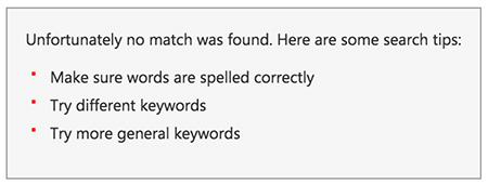
❌ Figure: Bad example - The list of "suggestions" is just noise and can confuse the user
❌ Figure: Bad example - Having an icon implies that an error happened which is not the case
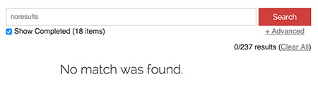
✅ Figure: Good example - Plain and clean screen
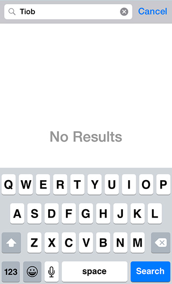
✅ Figure: Good example - Plain and clean screen on mobile
Note: In case the message you're showing is a "pass" or "fail, it is recommended to use an icon as per Do you use icons to enforce the text meaning?