Control Choice - Do you know when to use CheckBoxes?
Updated by Brady Stroud [SSW] 1 year ago. See history
Checkboxes are presented as small square box in user interfaces. It has two states: checked and unchecked.
When to use checkboxes in UI design
Checkboxes are used in forms to indicate an answer to a question, apply a batch of settings or allow the user to make a multi-selection from a list. Alternatively, a single checkbox may be used for making single selections – such as Boolean True or False statements (e.g. “Do you agree with the terms and conditions? Yes or no”).
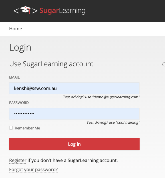
✅ Figure: Good example - Accepting or refusing to remember accounts when login to SugarLearning (the single selection checkbox)
CheckBoxes are also suitable to use for enable or disable sections and to tell the user that these sections do not need configuring for the application to run.
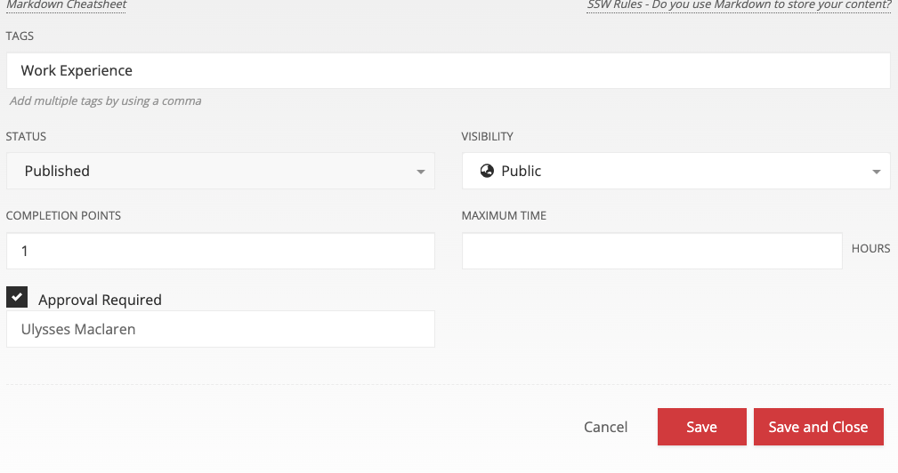
✅ Figure: Good example - CheckBoxes are used to setup the approval workflow in SugarLearning, only need to enter the approv when the checkbox is checked
Checkboxes allow the user to select one or more from a wide range of options. Applications use a series of checkbox groups to help the user filter search criteria.
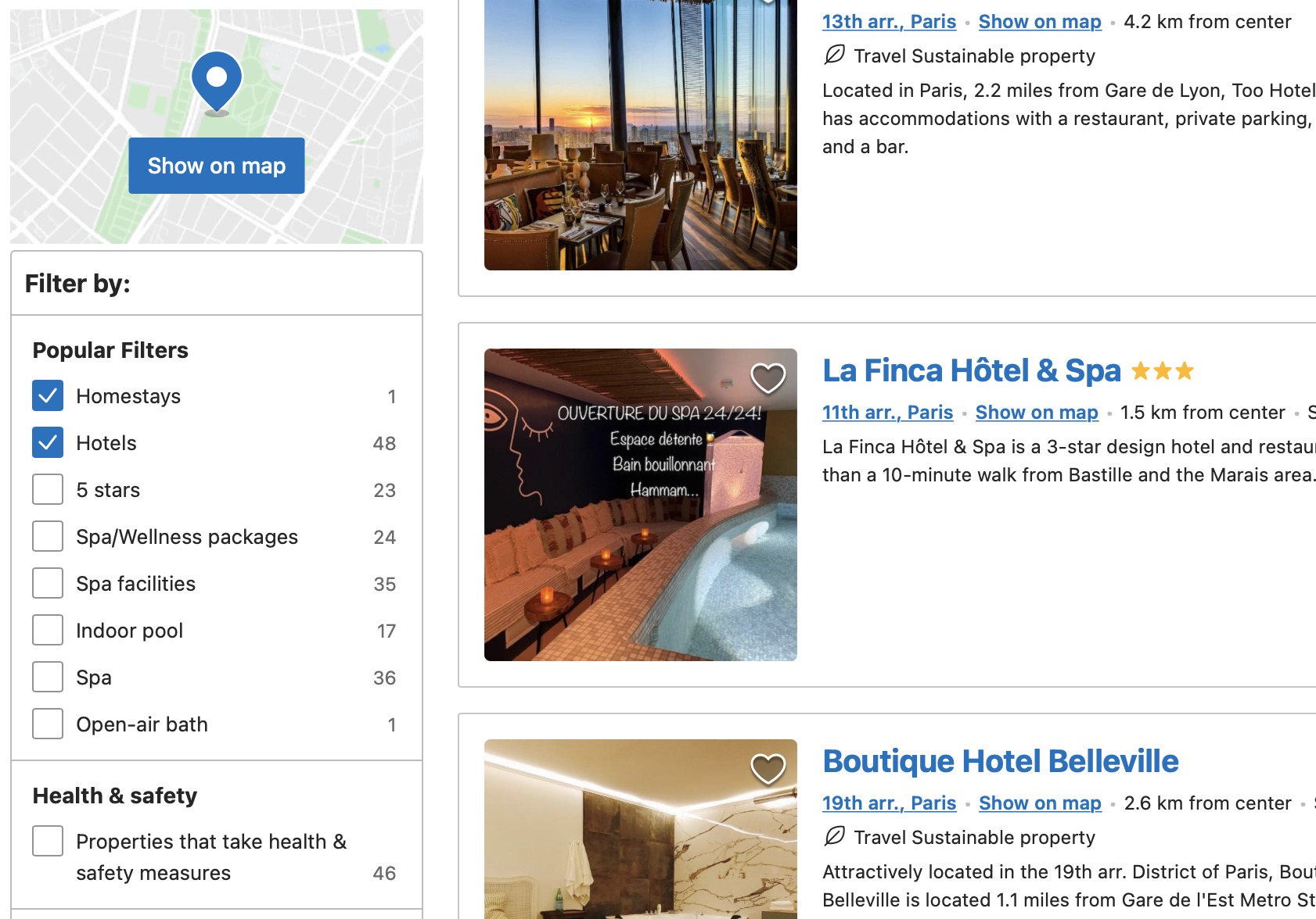
✅ Figure: Good example - Booking.com’s users frequently use the checkbox filters when making a booking
If there are only 2 options available on the form (usually a yes/no answer), the use of a checkbox is more intuitive than radio buttons. Usually, use radio buttons if there are more than 2 options; or if the labels information are more complex than a yes/no.
When to use options group Radio Buttons instead of ComboBox?
When the options are static items (not database driven) and they can fit on the screen (about 2-5 items), they should be radio buttons.
The bad thing about having a ComboBox in this scenario is the user needs 2 clicks to change the value...
- Click the little "v" button to see the available options
- Then click the option to select
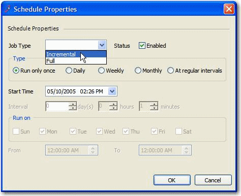
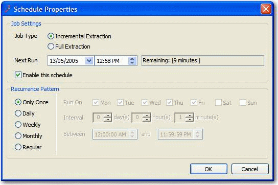
❌ Figure: Bad example - ComboBox is used for "Job Type" where it contains only 2 options
The good thing about an options group is that the user can see all the available options without clicking, and select the option with just 1 click.
✅ Figure: Good example - Radio Buttons are used and aligned vertically