Do you provide alternate sizings for Bootstrap columns?
Updated by Brady Stroud [SSW] 1 year ago. See history
Bootstrap provides a powerful, responsive layout with its rows and columns. The common way to use Bootstrap's layout system is to create a basic grid which will appear as horizontal columns on the desktop but then stack on a smaller screen such as mobiles. This is done with a single set of .col-md-* classes.
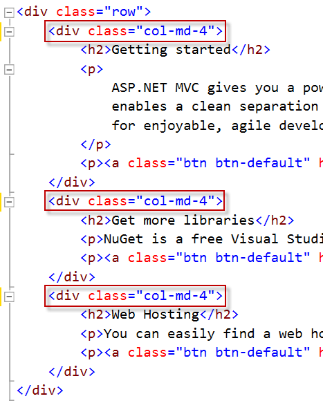
❌ Figure: Bad example - create the default stacking layout with Bootstrap
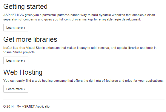
❌ Figure: Bad example - the default stacking behavior on small devices
Did you know you can have more control over the responsive layout by including multiple column classes? The ability to control the layout across multiple screen sizes is a powerful tool within Bootstrap. For example, if you don't want your columns to stack on smaller devices, use the smaller grid classes by adding additional column classes (e.g. .col-xs-* .col-sm-*) to the respective <div>s.
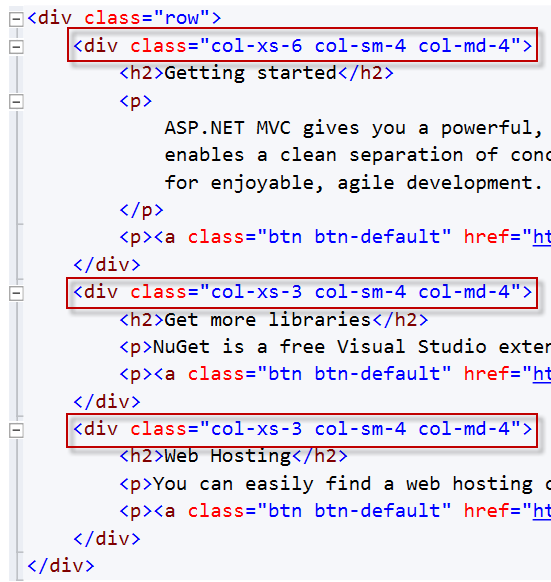
✅ Figure: Good example - add additional column classes to your columns

✅ Figure: Good example - On a smaller device, these columns now arrange horizontally as desired