Do you realize that a good interface should not require instructions?
Updated by Brady Stroud [SSW] 1 year ago. See history
The corner stone of good user interface design is that if your users need instructions, you haven't done a good job. Of course with particularly complex applications there will be exceptions to this rule, but all developers should aim to make your interface as self-evident as possible.
- There are no surprises
- There is no need to use help
- No excuse for RTFM (read the freaking manual)

Figure: A good interface does not need instructions!
A good UI is:
- Intuitive
- Feels fast e.g. no white screen, threading code
- Consistent
- Minimal popups
- No clutter - not busy
- Good error handling
- Easy to customize + apps (aka a platform)
- Gamification e.g. badges
Suggested reading:
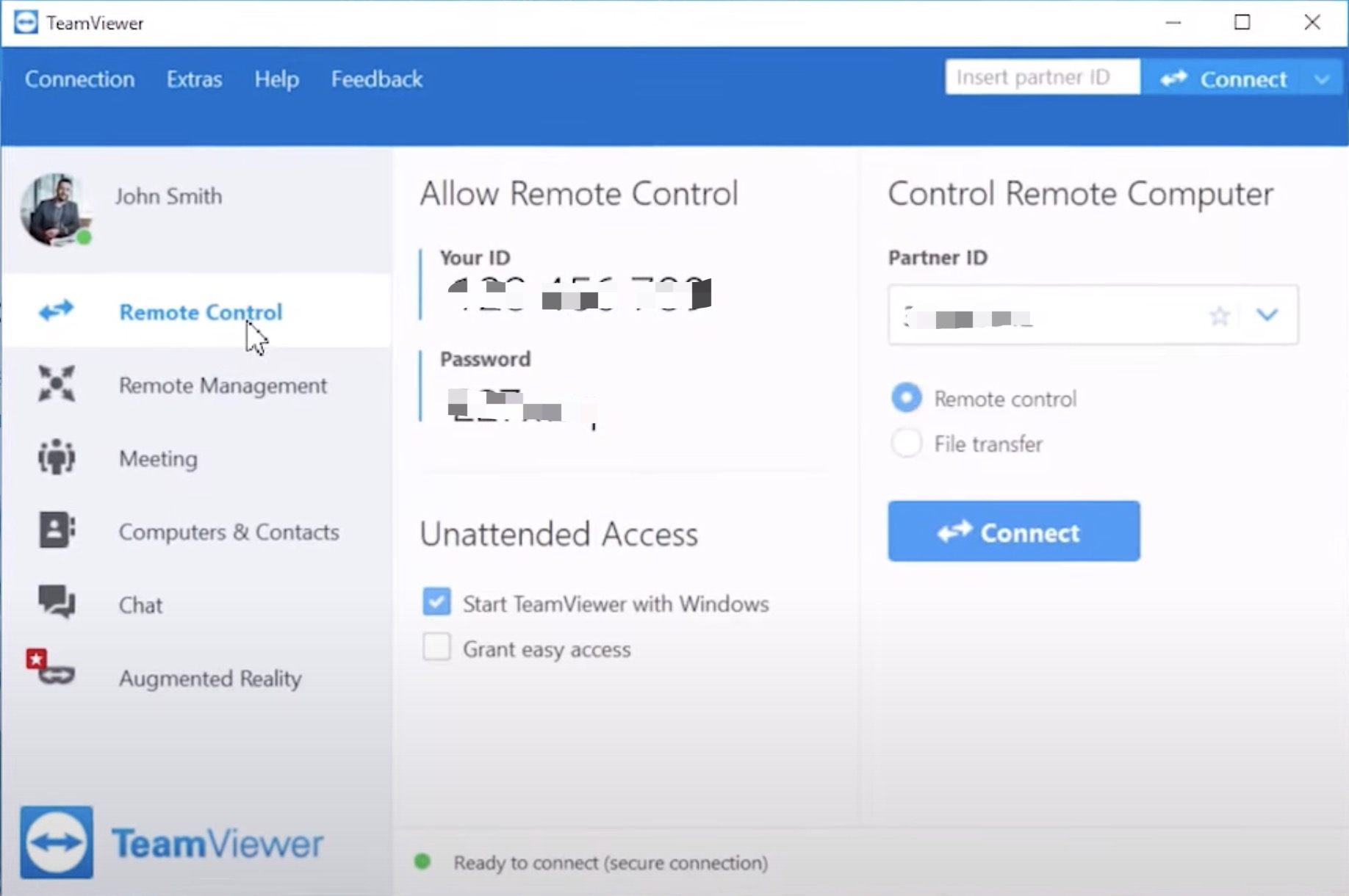
✅ Figure: Good example - Teamviewer's interface requires very little explanation

✅ Figure: Good example - See the fly? (an example of excellent usability) Dutch manufacturers realized that a fly painted on the urinal became a "target" for men using the facility. And the fly is positioned in precisely the right place for minimal spillage or splash back. Clever people those Dutch!