Do you use the hamburger menu icon wisely?
Updated by Micaela Blank [SSW] 28 days ago. See history
Hamburger menus are everywhere—those three stacked lines that hide site or app navigation. They became popular for decluttering mobile UIs, but they come at a cost: reduced discoverability, slower navigation, and lower engagement.
When should you use a hamburger menu?
Use it only when screen space is tight—typically on mobile. Otherwise, always prefer showing navigation visibly.
A desktop web app with ample space hides primary navigation behind a hamburger menu.
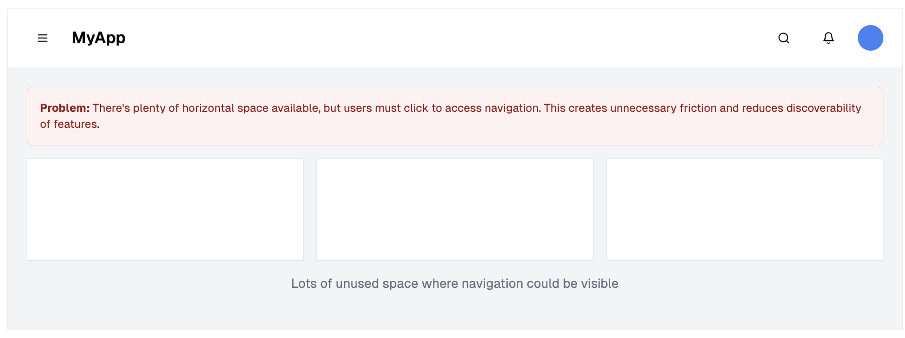
❌ Figure: Bad example – On desktop, navigation should be visible when screen space allows. Hiding it behind a hamburger reduces usability
A mobile app uses a hamburger menu to preserve space while offering a clean, focused UI.
::: good img-medium
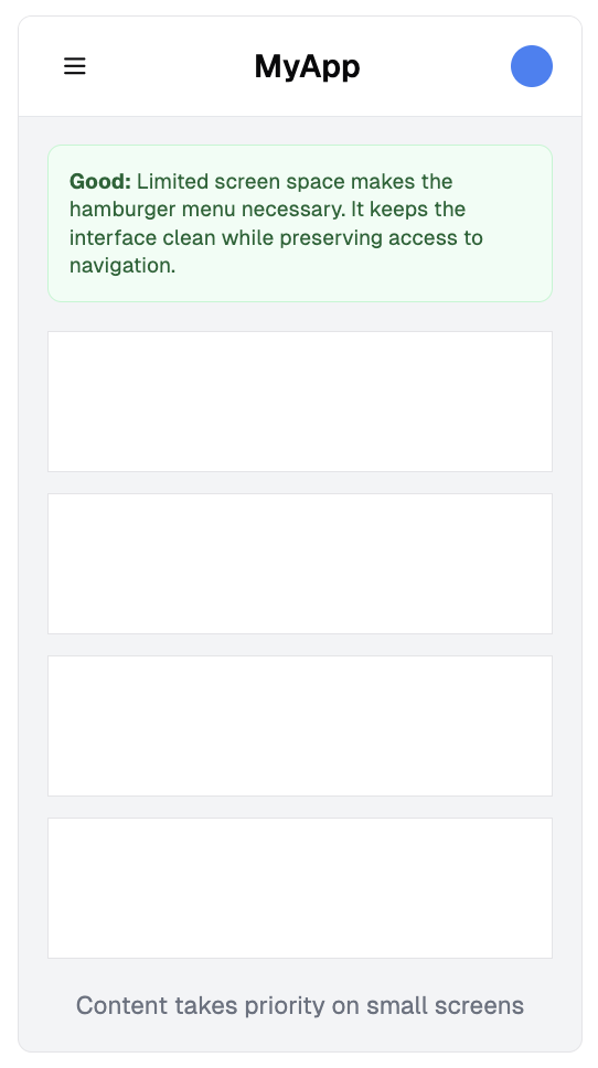
Figure: Good example – On mobile, screen space is limited, so hiding the nav behind a hamburger is appropriate
:::
Where should you place it?
| Device/Platform | Preferred Placement | Why |
| Android apps | Top left | Matches Material Design and Android conventions |
| iOS apps | Top right | Aligns with iOS patterns; better for right-thumb reach |
| Mobile websites | Top left | Consistent with web standards; easier for navigation + back button |
| Desktop websites | Top left (if used) | Only use if screen space is constrained (e.g. dashboards) |
❌ Common mistakes to avoid
- Using a top-right hamburger on desktop – This breaks user expectations. On desktop, primary navigation belongs on the left or fully visible
- Combining a hamburger menu with bottom navigation – Choose one. Using both creates confusion and redundancy
- Hiding essential links – Important actions should be visible. Hiding them behind a menu lowers engagement and completion rates
✅ Best practices
- Use the standard 3-line icon – don't reinvent it
- Include clear animation or toggle state
- Make sure it's easy to reach on mobile—don’t place in hard-to-tap corners
- If you only have a logo + menu, favor left placement for balance and ergonomics
- Test with users to confirm comprehension and usability
Use the hamburger menu only when needed, place it where users expect it, and never use it as an excuse to hide important navigation. Always test your decisions—navigation is too important to guess.