Do you know when “less is more”?
Updated by Brady Stroud [SSW] 1 year ago. See history
We live in a complicated world with too many distractions, where information overload is commonplace. “Less is more” is all about keeping things simple and achieving a design with the least number of elements required to deliver a message effectively.
Keep it simple
"Just because we can does not mean we should"
It is common to include design elements, features, or product enhancements solely because we think we should. This approach can unnecessarily complicate a design and overwhelm a user.
Applying "Less is more"
Thumbnail designs

❌ Figure: Bad example - Overcrowded thumbnail design with too many elements

✅ Figure: Good example - Simpler thumbnail design with less visual elements
By keeping things simple, we reduce complexity and avoid cognitive overload for our users. Making simple changes like using shorter, more descriptive language or minimising the overall number of design elements will make the overall message of a design much clearer to understand.
UI interface

❌ Figure: Bad example - Event cards have many rows and highlights

✅ Figure: Good example - Event information have fewer highlights
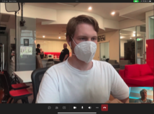
Stage background

❌ Figure: Bad example - Presenter with graphically busy background

✅ Figure: Good example - Presenter with simple textured background
Office layout
❌ Figure: Bad example - cluttered office background

✅ Figure: Good example - neater office background
So next time you think about designing something, try to keep it simple and remember... “less is more”.