Do you use clean designs when creating forms?
Updated by Michelle "MishManners®™" Duke 5 months ago. See history
As we know, an image is worth a thousand words. So here are some examples of how to make cleaner forms:
Bad Example
A fairly standard Access 97 application that needs some love (Before a makeover)
❌ Figure: Avoid using background colors for your form controls - they can be confusing
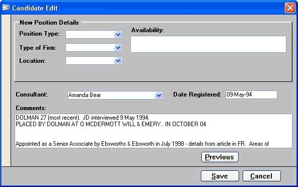
❌ Figure: Avoid using non-standard fonts on your forms - keep them as close to Windows XP forms as possible
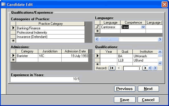
❌ Figure: All these forms will be grouped into a tabbed form
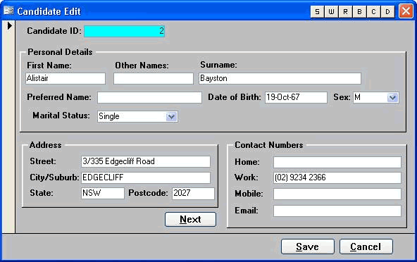
❌ Figure: The form is backward, with the employee's details at the top. It's not clear what needs to be changed, and the form is missing the current key information
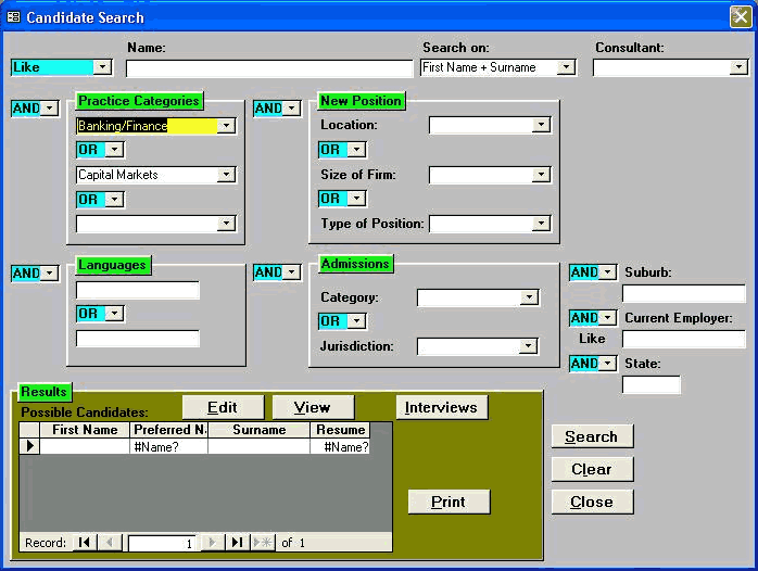
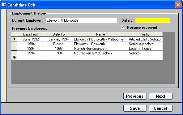
❌ Figure: The colors on this form are very distracting and add no value to the user - keep it clean
Good Example
Screenshots of the existing Application in Access 97 after an SSW makeover (Good)
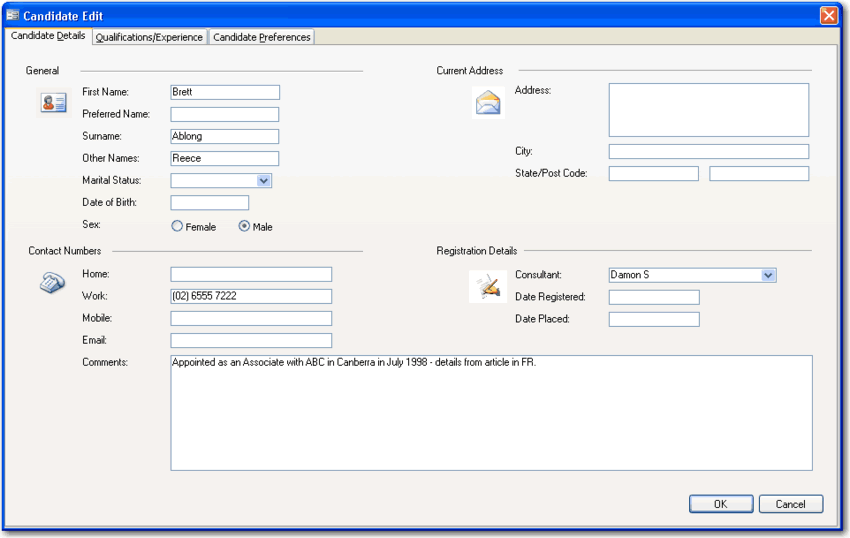
Figure: This is the same application above - can you believe it? We grouped the forms into tabs
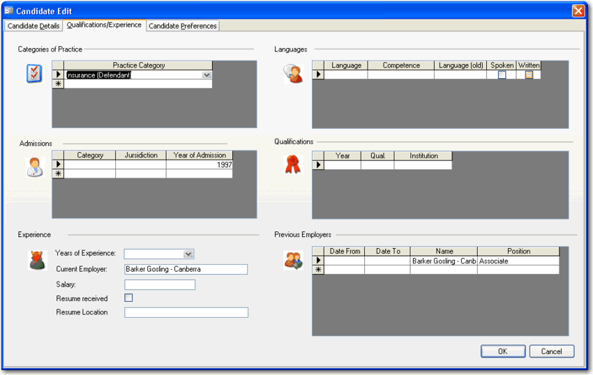
Figure: The icons give the form visual appeal and help to break up the plain colors
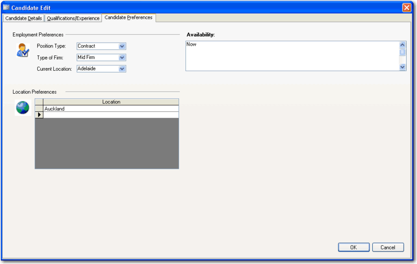
Figure: It's easy to present your form more cleanly and with a Windows XP feel
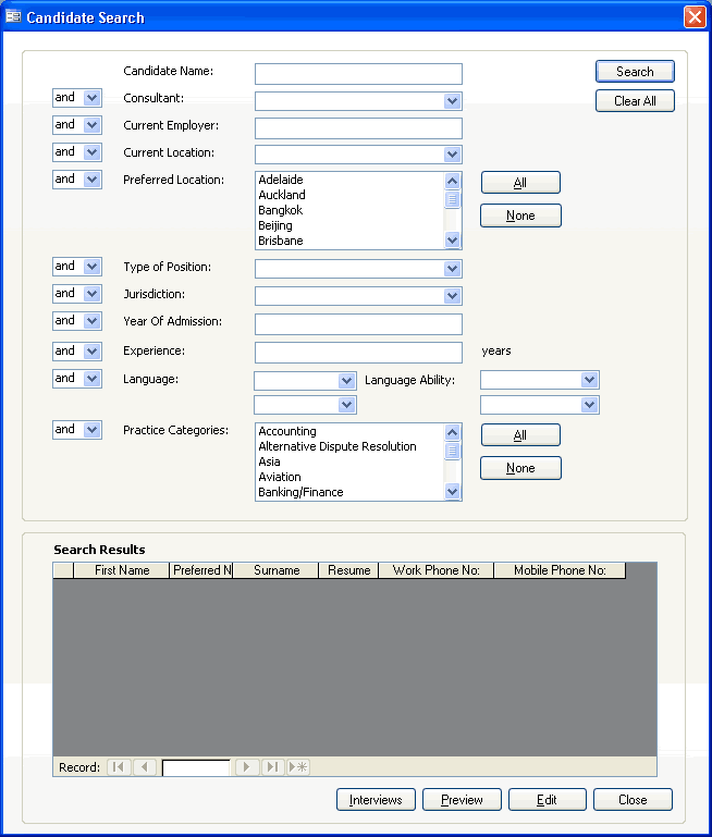
Figure: Even tricky forms with lots of logic can be tidied up. We used XP-styled controls and careful alignment to make this form more usable
Better Example
Access 2007 is an Easy Way to Give Your Old Access Application a new look (Best)
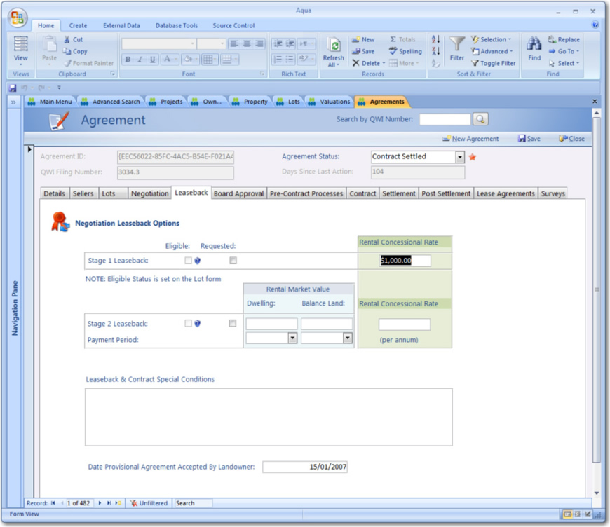
These samples are from a Property Purchase and Negotiation Tracking application created for Queensland Water Infrastructure.
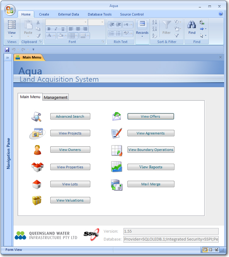
✅ Figure: The main menu of one of our first Access 2007 UIs. It looks even better than the revamped Access 97 application
✅ Figure: Note the Action buttons in the top right hand corner - they are based on the Access 2007 templates
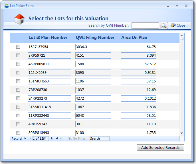
✅ Figure: This picker form is based on a web-style picker UI such as Hotmail so users have a familiar UI
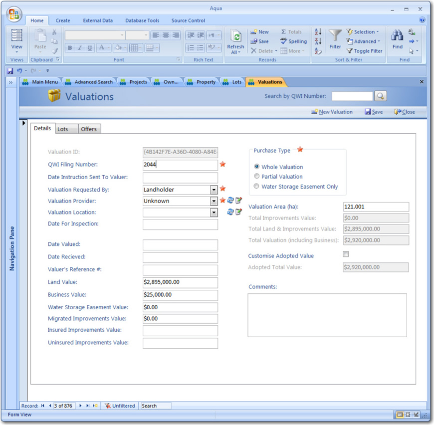
✅ Figure: With the use of frames with background colours, we have visually grouped controls