Do you use dynamic viewport units?
Updated by Jord Gui [SSW] 1 year ago. See history
In today's mobile-first era, ensuring your website looks great on all screen sizes is crucial.
On mobile devices, viewport sizes fluctuate due to dynamic toolbars like address bars and tab bars, causing elements to potentially overflow beyond the viewport.
To address this issue, the CSS Working Group introduced dynamic viewport units (like dvw, dvh, dvi, dvb, dvmin, dvmax).
Implementing these units into your website allows it to be responsive across desktop and mobile platforms. Dynamic viewport units are compatible with every browser and is even supported in popular CSS frameworks like Tailwind CSS (as of v3.4)
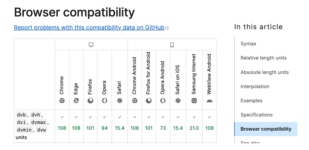
Figure: Browser compatibility list for dynamic viewport units
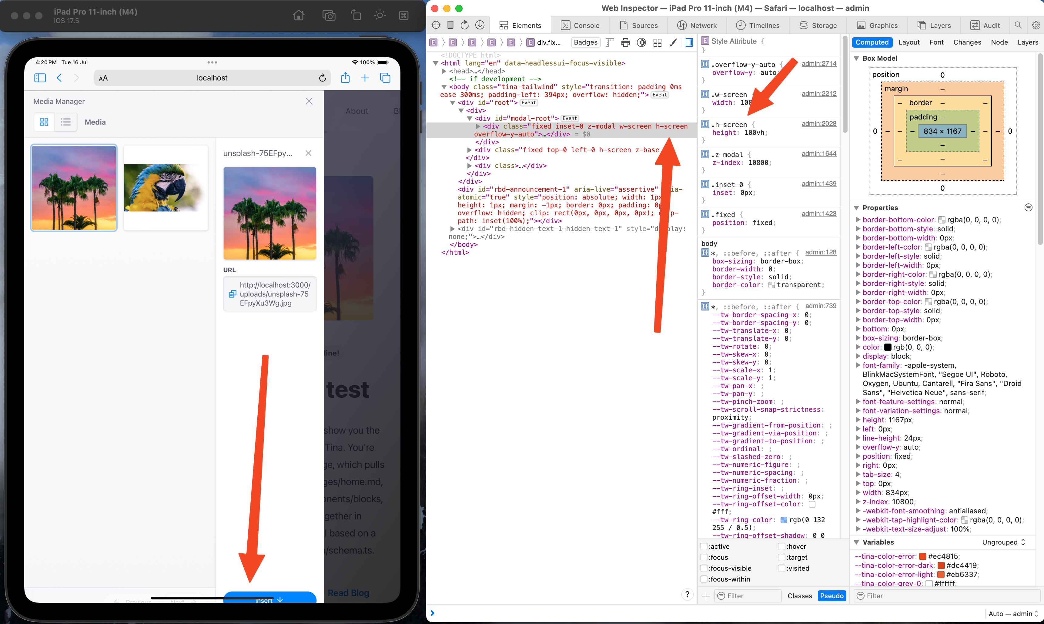
❌ Figure: Bad example - TinaCMS media manager window overflowing when open on iPadOS Safari when using view height

✅ Figure: Good example - TinaCMS media manager window responding properly when open on iPadOS Safari when using dynamic view height