Do you have a consistent search results screen? (aka the Google Grid)
Updated by Brady Stroud [SSW] 1 year ago. See history
Every website out there has a page that displays the results of a search. No standard has been adopted throughout the web as nearly every site seems to have a different way of displaying data. However, Google is a very good example for displaying search results. Their result pages are clear and efficient, especially for a large result set.
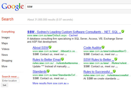
✅ Figure: Good example – Adopt Google's search result layout
So adopt Google's search result layout and it will give new and regular users a better navigation experience. Here's our standard layout for our search function.
Want the 'Google grid'? Then follow these rules to help users to navigate:
- Filters at the top (if more than one search parameter,then add a "search" button)
- The number of results found + how many seconds the search took to execute
- A statement that explains the criteria that you used for searching (or keep the criteria in the text box like google does)
- The number of pages found (hyperlinks centered in the middle), and these hyperlinks should be shown on the footer of the page only.
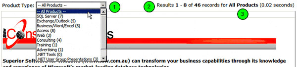
Figure: The header of SSW results screen - filter, number of results found, search criteria and time taken

✅ Figure: Good example - The footer of SSW product order listing page has the hyperlinks for pages 1 to 10 centered
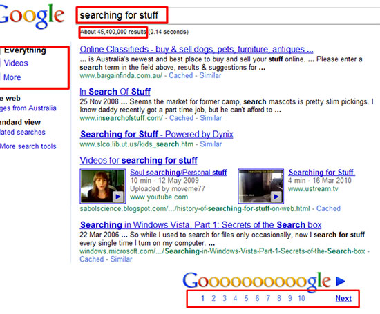
Figure: Google's classic search results